
Mobile Responsiveness Browser
Appvance IQ supports the use of a Mobile Toggle device which is a feature of the Google Chrome browser launched from Google Developer tools.
The updated Device Mode that will be available from Chrome 49 or later is an integral part of the now-mobile-first Dev Tools and extends the main Dev Tools bar.
Right-click from your Chrome browser and select Inspect and toggle the Device mode button to turn Device mode on or off.
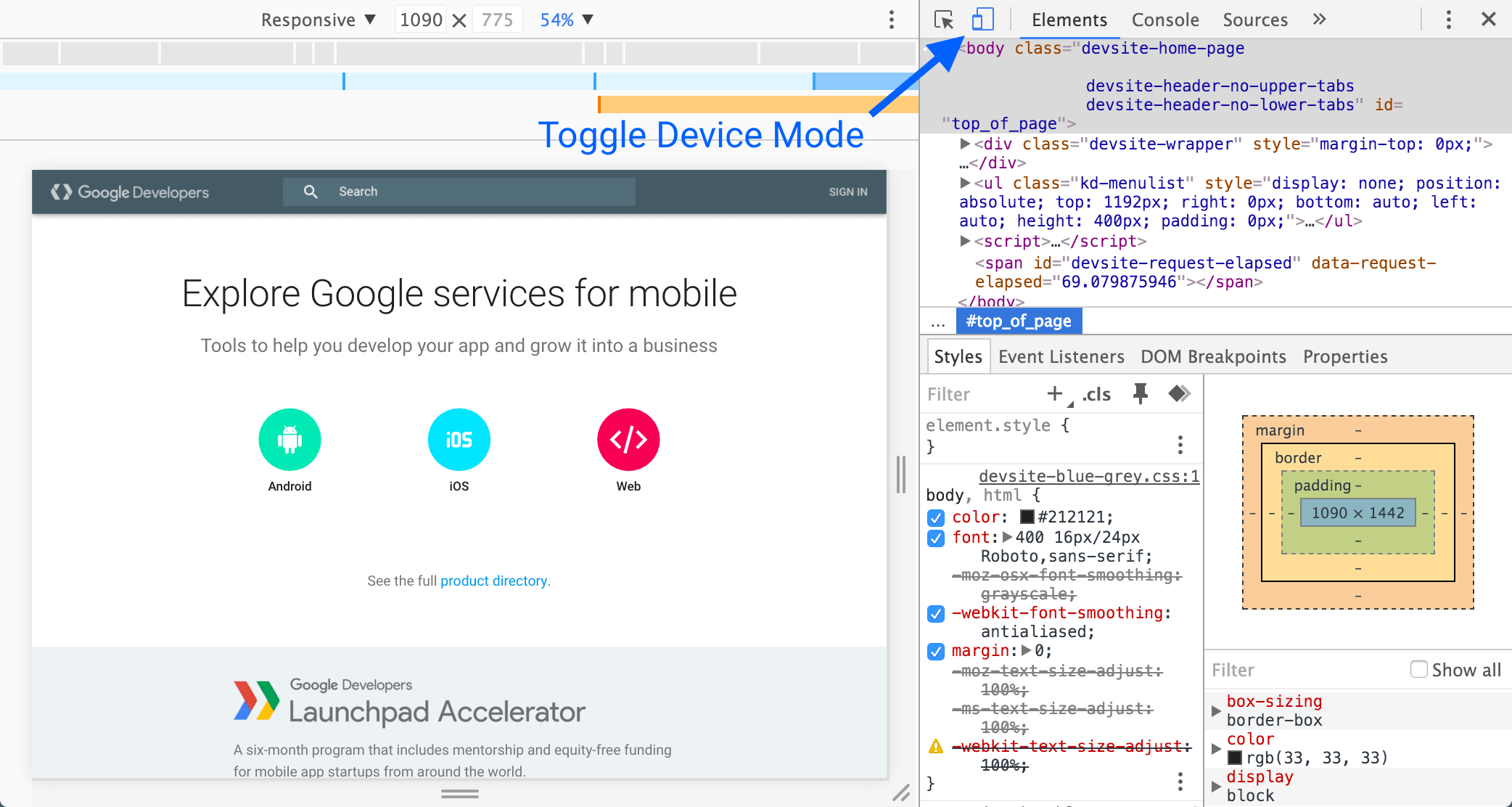
When Device Mode is on, the icon is blue, When it's off, the icon is grey.
Responsive mode
Appvance IQ uses Device mode on using the Responsive Mode as your default work mode. It is used during the active development of your site and app and resizes the view-port often to create a freely responsive design that adapts to even unknown and future device types.
Appvance IQ test designer supports a wide range of chrome responsive modes.
How to use in Appvance IQ
-
Once logged in go to Test Designer IDE under Record
-
Click File > New
-
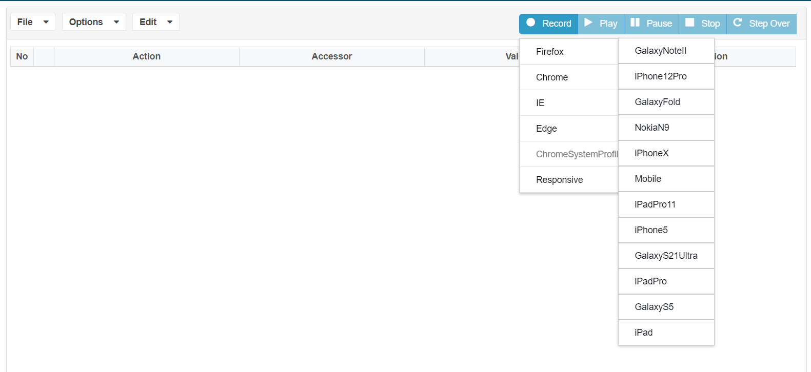
Under Record drop-down, you should notice Responsive > with the list of devices to choose from
-
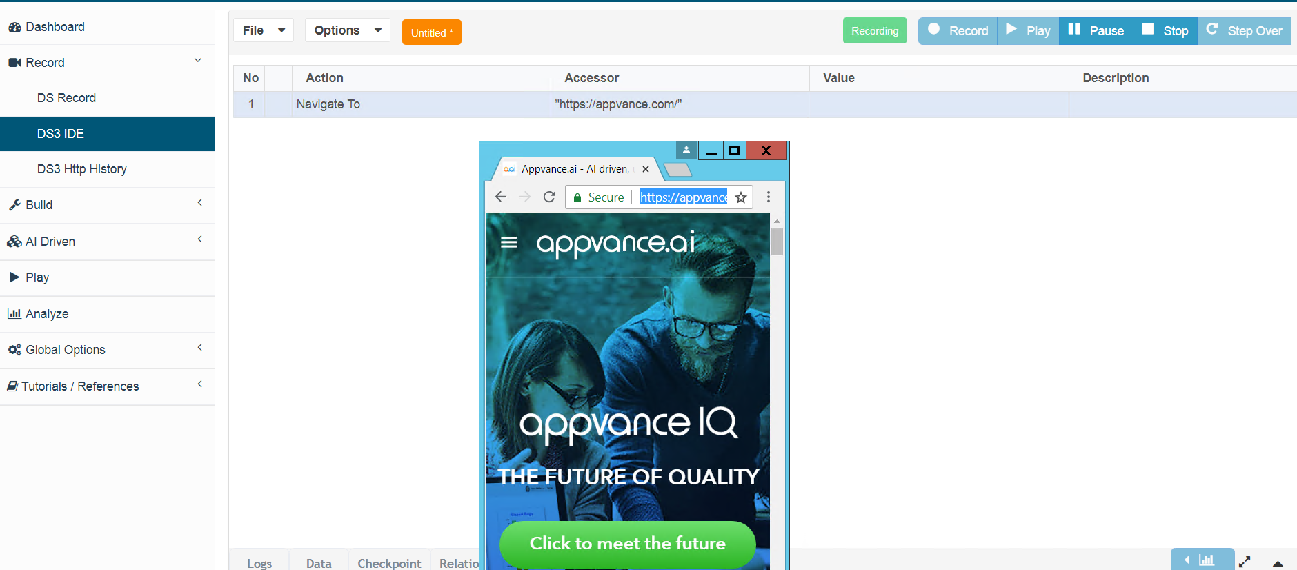
Select Responsive > preferred device from the list, Google Chrome should open in mobile responsive mode for recording based on the device chosen
-
You will notice that the browser would be rendered in a mobile mode based on the chosen device just like how the app would open on any mobile device
-
You could perform all the actions that are required to create a script in Test Designer
-
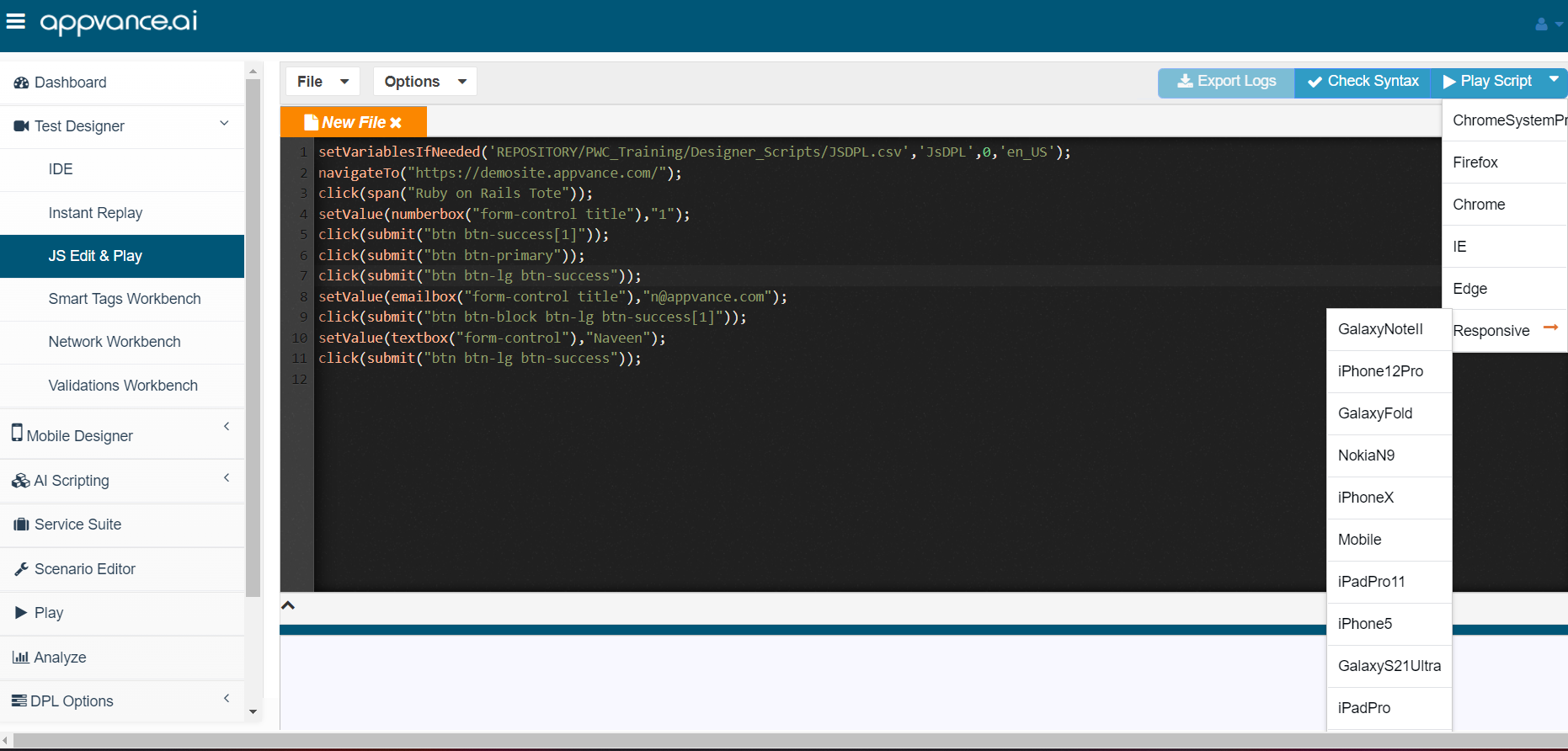
If there are any complex steps that require some scripting, you could make use of Test Designer JS Edit & Play under Build to create JS and playback in Record mode
-
These scripts can be re-purposed as Functional or Performance tests from Scenario Editor. The below example shows how to create a performance test using a Mobile browser
Creating your first mobile Performance Scenario
-
Open a browser, navigate to your Appvance IQ URL, and log in using your credentials
-
Select the Build option
-
Scenario Editor appears
-
Select File > New
-
From the Info tab, click Please select a Test Type box and select Performance Test
-
From the Test Management tab, select one of the Options from Completion Type for example Total Duration, Provide the Total Duration in Minutes
-
From the Test Cases tab, click Add a Test Case Execution
-
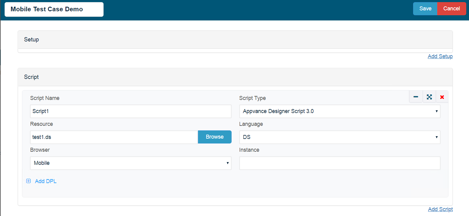
Enter a name for the test case in the Test Case Name box
-
Enter a name for the script in the Script Name box
-
Click the Script Type box and select Appvance Designer Script 3.0
-
Click Browse (to the right of the Resource box)
-
The Open window appears
-
Select the Appvance Designer Script 3.0 (file extension .ds) created in the prior Getting Started Guide, and click Open
-
The selected file appears in the Resource box
-
Click the Browser box and select the browser as MOBILE to use for playback
-
Click Save
-
The test case appears in the Iteration 1 list.
-
If necessary provide the Number of Users, you want to run the performance test in that duration.
-
Select File > Save
-
The Save window appears, displaying the Appvance Designer controller file system; not the local machine
-
Browse to the desired directory, enter a name for the scenario in the File-Name box, and click Save
-
To playback, click Play Scenario
-
The scenario execution status launches in a new tab, and a new browser window opens, using the browser indicated in the scenario configuration, which executes the specified Appvance Designer script.
-
When the Status displays Execution is done, click Test case(s) Executions
-
Select the first result in the Test case(s) Executions list
-
The output details, errors, requests & responses display on the corresponding tabs
-
Click the Output tab (left set of tabs, below Live Reports) to view additional reports pertaining to this scenario execution
Last updated: June 26, 2023
If you have any feedback on this topic, please contact us at documentation@appvance.ai